Bissell
ASK
Evolve the Bissell brand to better connect with families and pet owners.
We were asked to refresh their brand to better stand out in a crowded market.
CREATIVE TEAM
Charlie Herrmann, Jenna Klein, Sydney Gilles
BRAND DIFFERENTIATION
The creative team and I audited a range of pet and technology brands to reveal the best positioning for the Bissell brand identity. We aimed to bring a unique sense of warmth and history into the the often cool and impersonal technology space.
TYPOGRAPHY
With creative direction from Charlie Herrmann, I conducted extensive typeface
research to find a combination of faces that both acknowledged Bissell’s +140 year
history and highlighted their innovative products.
SHAPE LANGUAGE
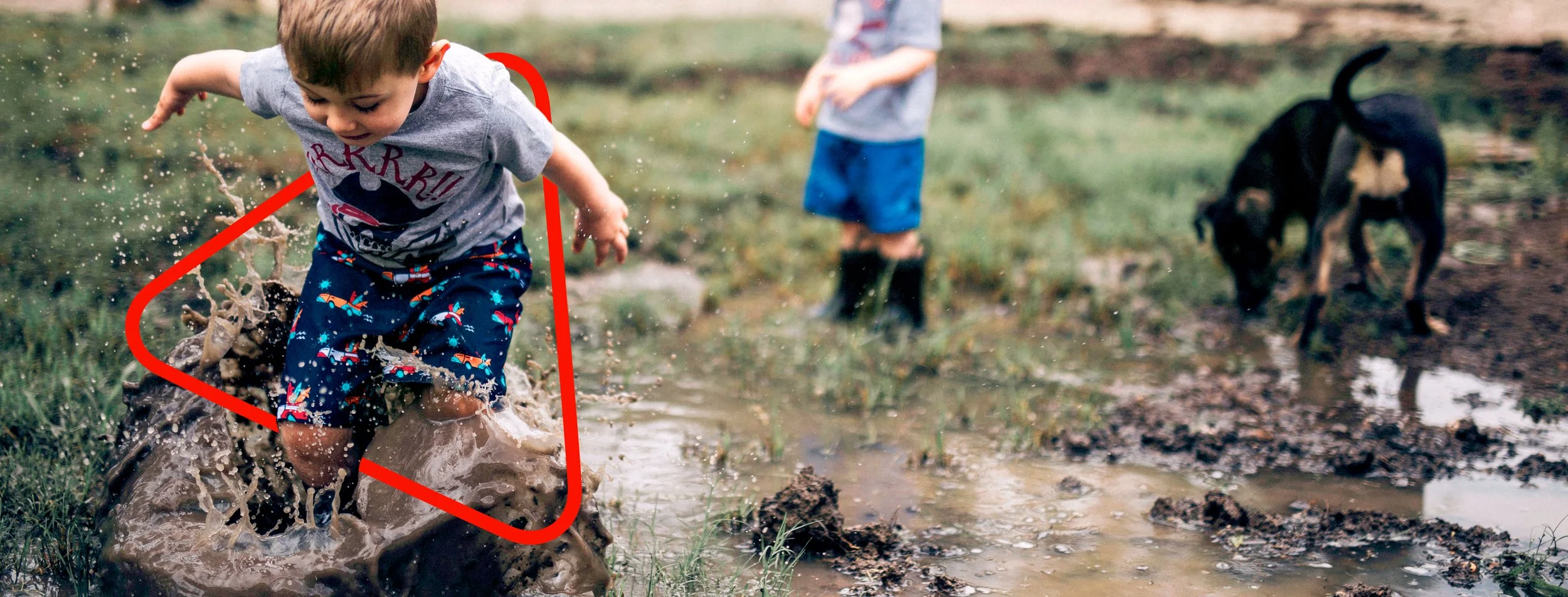
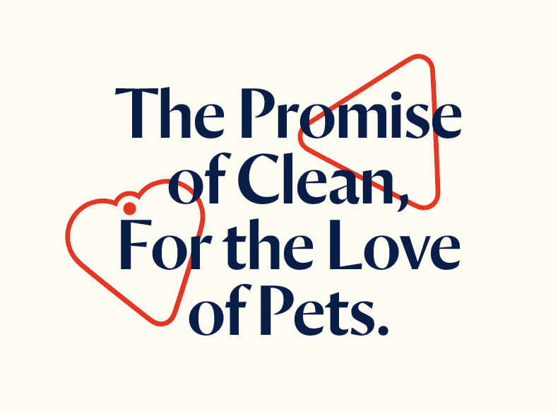
We created hero symbols to represent the two sides of Bissell’s brand:
the promise of clean and the love of pets.
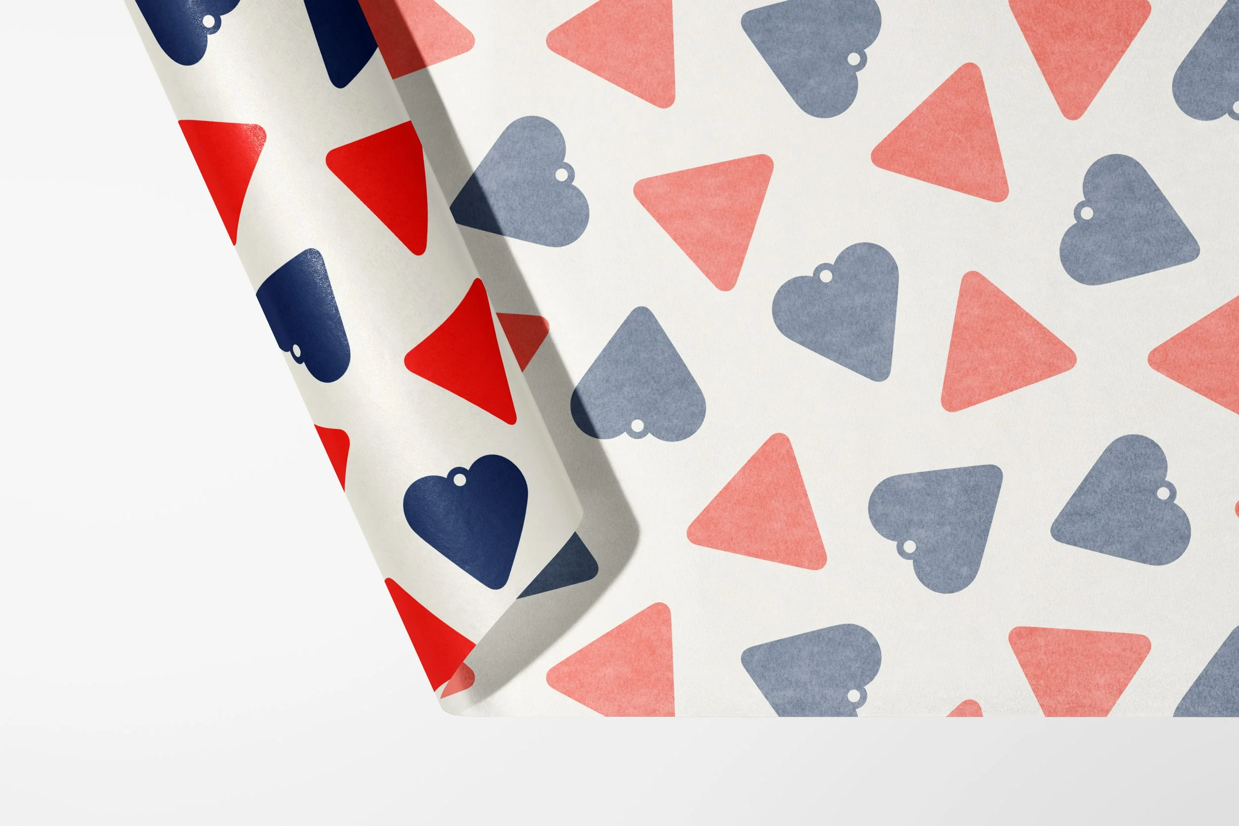
I worked on perfecting the brand shapes and creating repeatable
patterns for promotional materials.


