Seiko | The Gift of Time
ASK
Create a design language for a short film about Japan’s unique relationship with time.
We were asked to design titles, lower thirds, credits, and promotional materials for the film,
as well as direct graphic animation.
CREATIVE TEAM
Luke Williams, Sydney Gilles
TYPOGRAPHY
We carefully selected typefaces to reflect the complexities of Seiko’s identity. Recife Display, the elegant serif typeface used in titles throughout the film, captures Seiko’s luxurious craft, sharp precision, and long history. Hoefler and Co’s Decimal, the san serif typeface used in locator and descriptions, was inspired by watch face lettering. Decimal represents the innovative side of Seiko and is a direct reference to watch design.


MOTION DIRECTION
For the graphic motion of the film, we were inspired by how watches work. Our two column lower thirds move like and reflect the action of pulling out a watch crown. The text is pulled on to screen in steps and turned upward, as if changing the time.


LAYOUT + GRID
All on screen text is carefully aligned to our base grid. We played with columns, scale, and plenty of white space reflect the gridded simplicity of digital watch faces.


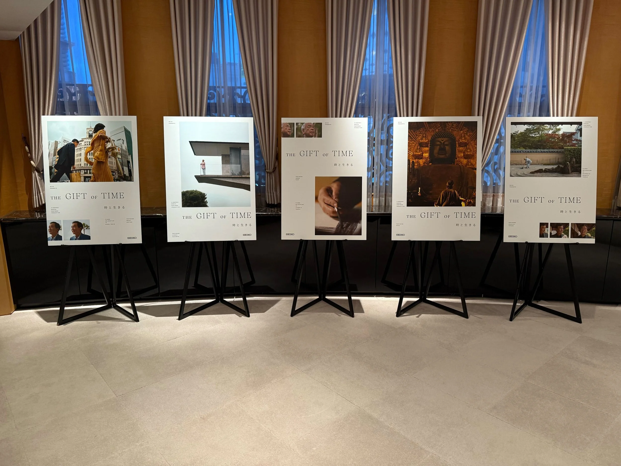
FILM POSTERS
We were asked to create a collection of 5 movie posters for the film premier in Tokyo, Japan. The posters highlight the cast members and key locations throughout the film. The Japanese principle of Ma, or negative space, is central to the film and informed our poster design approach.


